
Journal · 07 October 2026
Complementary colours: how to create contrast and visual harmony
Discover how to use complementary colours to bring energy to your paintings and create a strong visual impact.
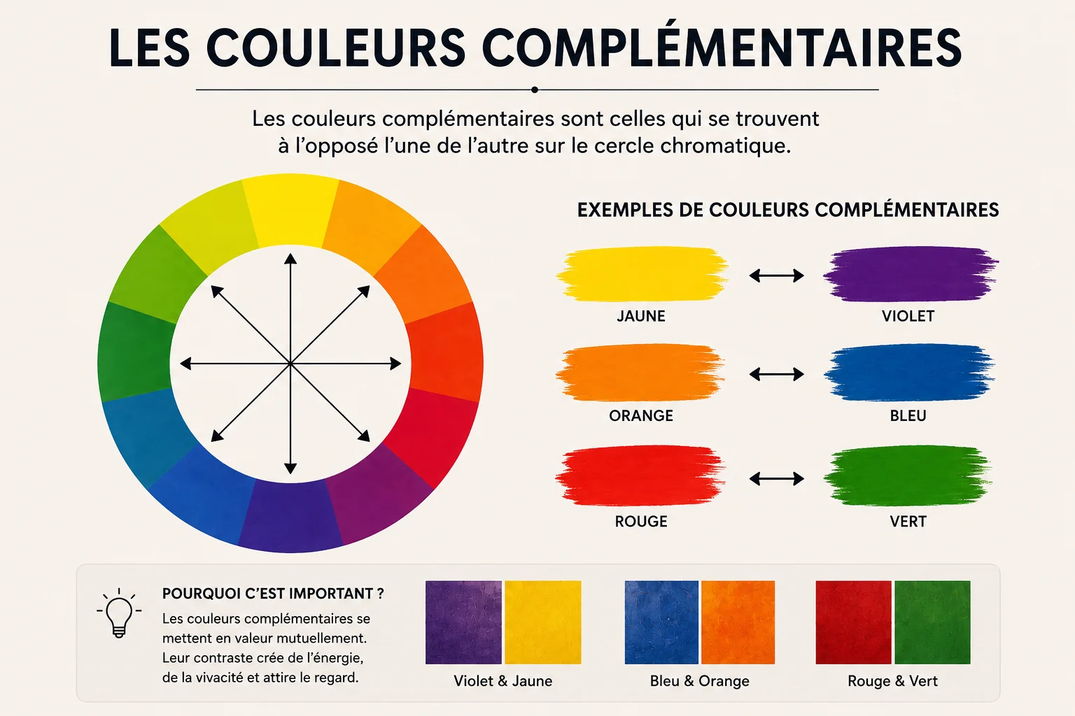
How can complementary colours transform a painting and capture the viewer’s eye?
What are complementary colours?
Two colours opposite each other on the colour wheel, for example red and green, blue and orange, yellow and violet.
Visual effects
- Create contrast
- Draw attention to a specific element
- Bring energy to the composition
Tips for using them
Use them sparingly so as not to overload the painting, and balance them with neutral or analogous colours.
Conclusion
Complementary colours are a powerful tool to energise your work and guide the viewer’s eye.
complementary colourscontrast in paintingvisual harmonycolour techniquespainting impact