Journal · 20 October 2026
Colour in painting: the complete guide
Colour wheel, primary to tertiary colours, warm and cool, complementaries, acrylic and layering: everything you need to understand the colour of a painting.
How does colour build the emotion of a painting? From the colour wheel to glazing, a guide to understanding colour and seeing artworks differently.
Before it is a technique, colour is a language. It sets a mood, guides the eye and stirs an emotion before we have even understood what a painting shows. This guide brings together the essentials, from the colour wheel to layering, and shows how they come alive in the artworks of the Pigment Caché studio.
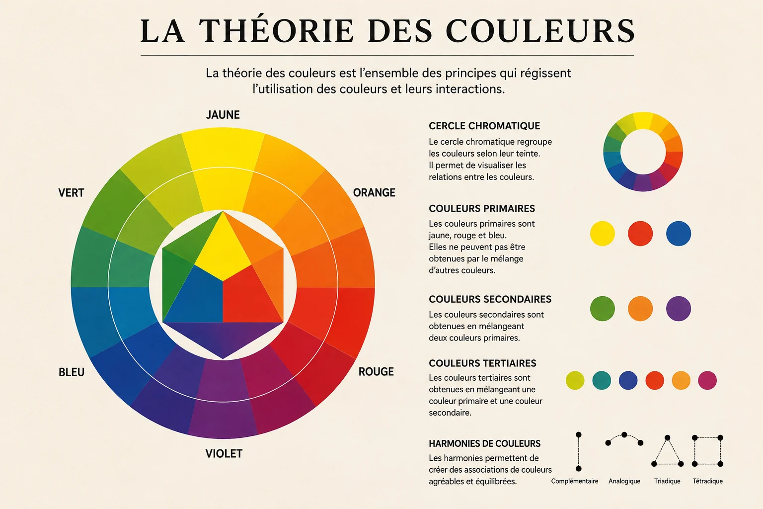
The colour wheel, a map of every colour
The colour wheel arranges colours around a ring. It is not only for beginners: it helps every artist predict a mix, build a harmony or create a deliberate contrast. Each position on the wheel says something about the relationship between two hues: close together, they agree; opposite, they answer each other.
Primary, secondary, tertiary: mixing without getting lost
The primary colours, red, blue and yellow, cannot be made by mixing: they are the basis of all the others.
The secondary colours come from mixing two primaries:
- red + yellow = orange
- blue + yellow = green
- red + blue = violet
The tertiary colours mix a primary with a neighbouring secondary: yellow-green, blue-green, red-orange… They give paintings their richest nuances. In practice, adding a touch of the complementary colour softens a hue and makes it more natural, closer to the tones we find in real materials and light.
Warm and cool colours: the temperature of a painting
Warm colours, reds, oranges and yellows, suggest energy, warmth and movement; they seem to come towards the viewer. Cool colours, blues, greens and violets, bring calm, depth and serenity; they seem to recede. Combining the two creates visual relief: a cool background and a warm subject give an impression of depth, even on a flat canvas.
In Tapis Berbère, gradients of yellow, orange and brown carry the warmth of the desert; in Porte de Chefchaouen, the blues bring the coolness and silence of the lanes.
Complementary and analogous colours: contrast or harmony
Complementary colours face each other on the wheel: red and green, blue and orange, yellow and violet. Side by side, they intensify each other and catch the eye at once. They are used to create a focal point or to give a composition energy, in moderation: too many saturated complementaries tire the eye. Neutral or analogous colours balance them.
Analogous colours sit next to each other on the wheel, such as blue, blue-green and green. They bring softness and visual unity. The diptych Union plays with both: each canvas stays within its family, blues on one side, warm tones on the other, and it is their almost complementary meeting that gives the work its tension.
Colour and emotion
Each colour carries a psychological charge: blue soothes, red stimulates, green balances, black concentrates. These associations vary between cultures, but they allow the artist to shape what the viewer feels. The contrast of deep black and gold leaf in Golden Leopard evokes self-control and inner strength, while the abundant palette of Rappel de Couleurs recalls the vitality of the interiors of the past.
Acrylic, a technique at the service of colour
Acrylic paint is valued by beginners and experienced artists alike. It dries in a few minutes to a few hours, so layers can be built up without waiting for days. With mediums, it can be as fluid as watercolour or as thick as paste: washes, impasto, glazes, textures, collage. Its pigments keep their intensity over time and stand up well to light.
This flexibility is what makes the studio’s reliefs possible: acrylic is combined with modeling paste to sculpt the surface before it is coloured.
Layering to create depth
Layering means painting several successive coats, transparent or opaque. It strengthens luminosity, plays with transparency and adds visual richness.
- Glazing: a thin, transparent layer that lets the colour beneath show through and shifts its hue without hiding it.
- Opaque layers: to cover, correct or redraw certain elements.
- Gradients: to create atmospheric effects and soft transitions.
On a textured surface, layering takes on another dimension: colour settles differently in the hollows and on the ridges, and raking light reveals every layer.
Oil or acrylic: how to choose?
- Drying: fast for acrylic, ideal for layering; slow for oil, perfect for blending.
- Colour: oil offers deep, saturated tones; acrylic is vivid and dries faster.
- Conservation: both can last for centuries if the work is protected; acrylic resists humidity better.
The choice depends on style, available time and the effects you are after. For sculpted textures and quick layers, acrylic remains the most natural ally.
Key takeaways
Colour theory is not a set of fixed rules: it is a universal visual language. The colour wheel helps you mix, temperature and complementaries build space and emotion, and technique, acrylic, glazing, layering, gives it all substance. To see these principles at work, in texture and relief, discover the original artworks of Pigment Caché.